Finity Falcon Magazine
The Finity Falcon magazine is a yearly publication that went out to the employees at the health technology company I worked at as an in-house designer. The articles ranged from company events and achievements to employees hobbies and interests. The main goal of this publication was to create community within the company.
I worked with a team of designers to create a new layout design for the 2019 publication of the company’s magazine. For each publication the in-house designers had the freedom to pick the design direction they wanted to do. As the lead for this project I chose a more elegant and clean design with the use of typography and white space, because this was drastically different from everything else that had been created at the time and wanted us to have fun exploring this new direction.
I created the design direction for this project and made sure we maintained consistency throughout. Also, a long with the two designers worked on the design layouts, illustrations and photography edits.
Photography Challenges
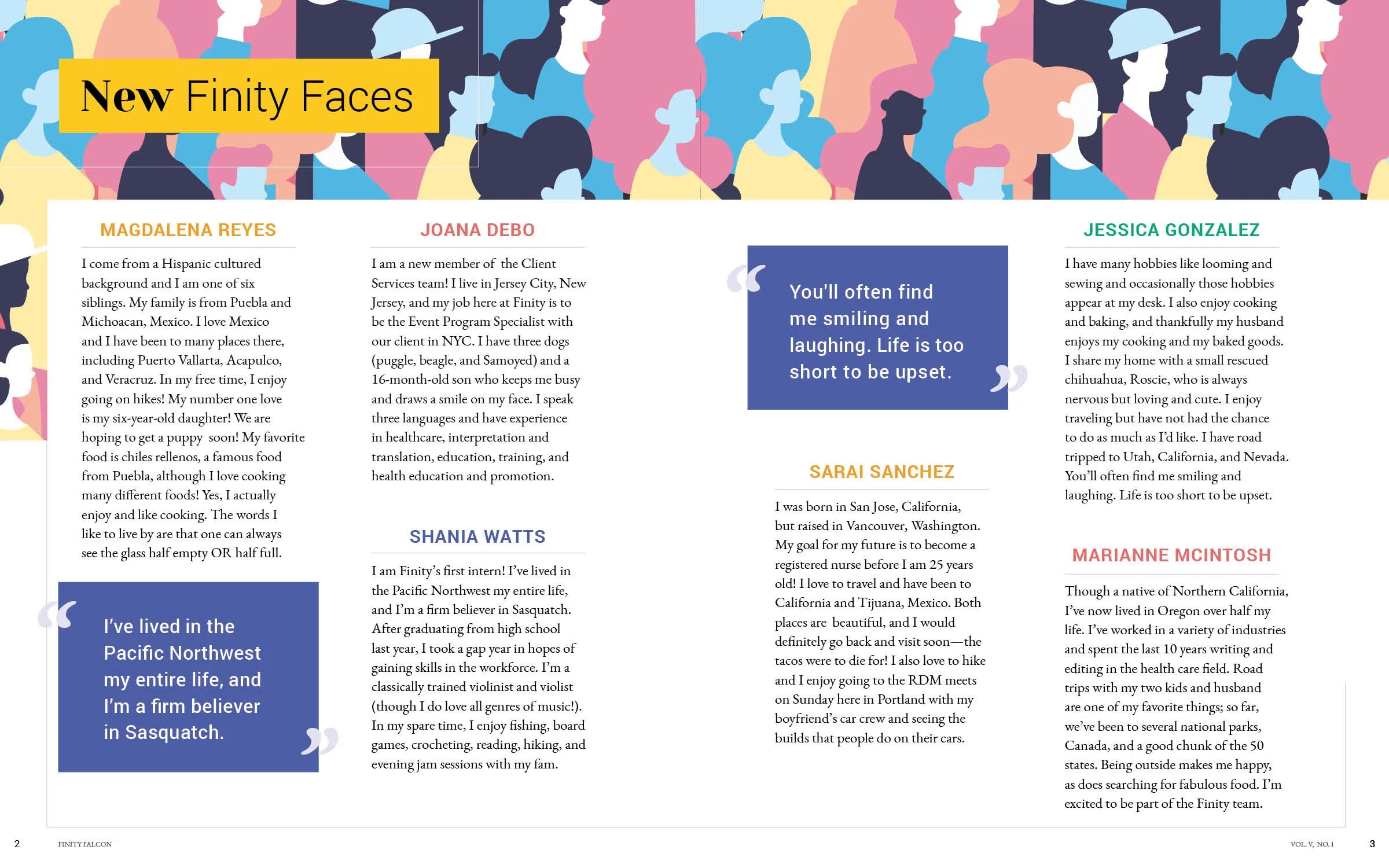
We encountered some difficulties with the photos that were provided to us. They were of low resolution, poorly lit and lacked consistency. To address this issue, our design team agreed to apply a visual effect to the images in order to maintain a cohesive look.
Art-Direction
Design
Illustration


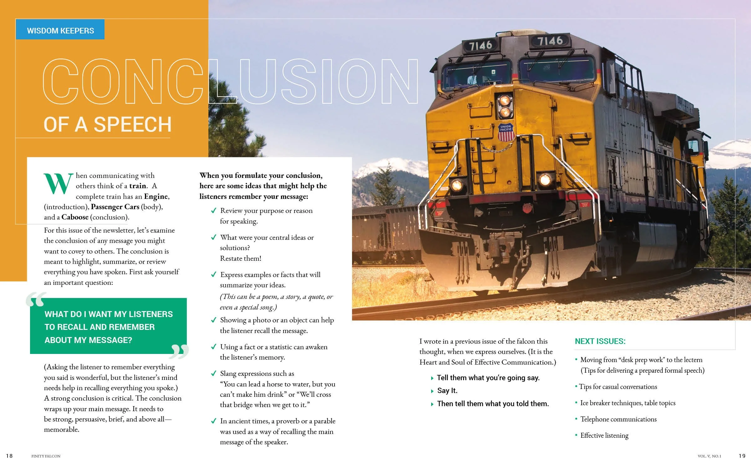
Landscape Photography
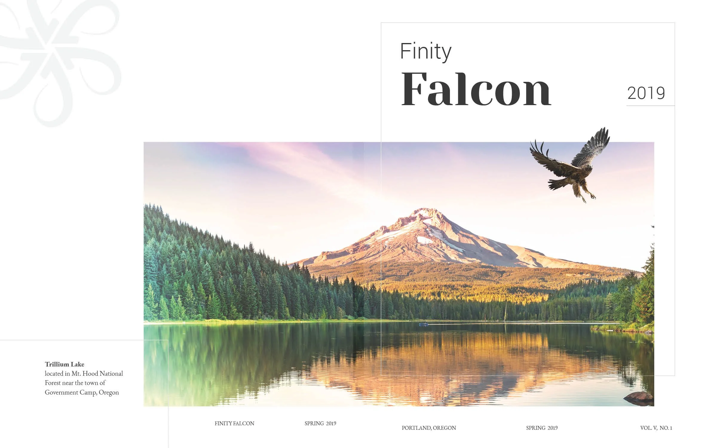
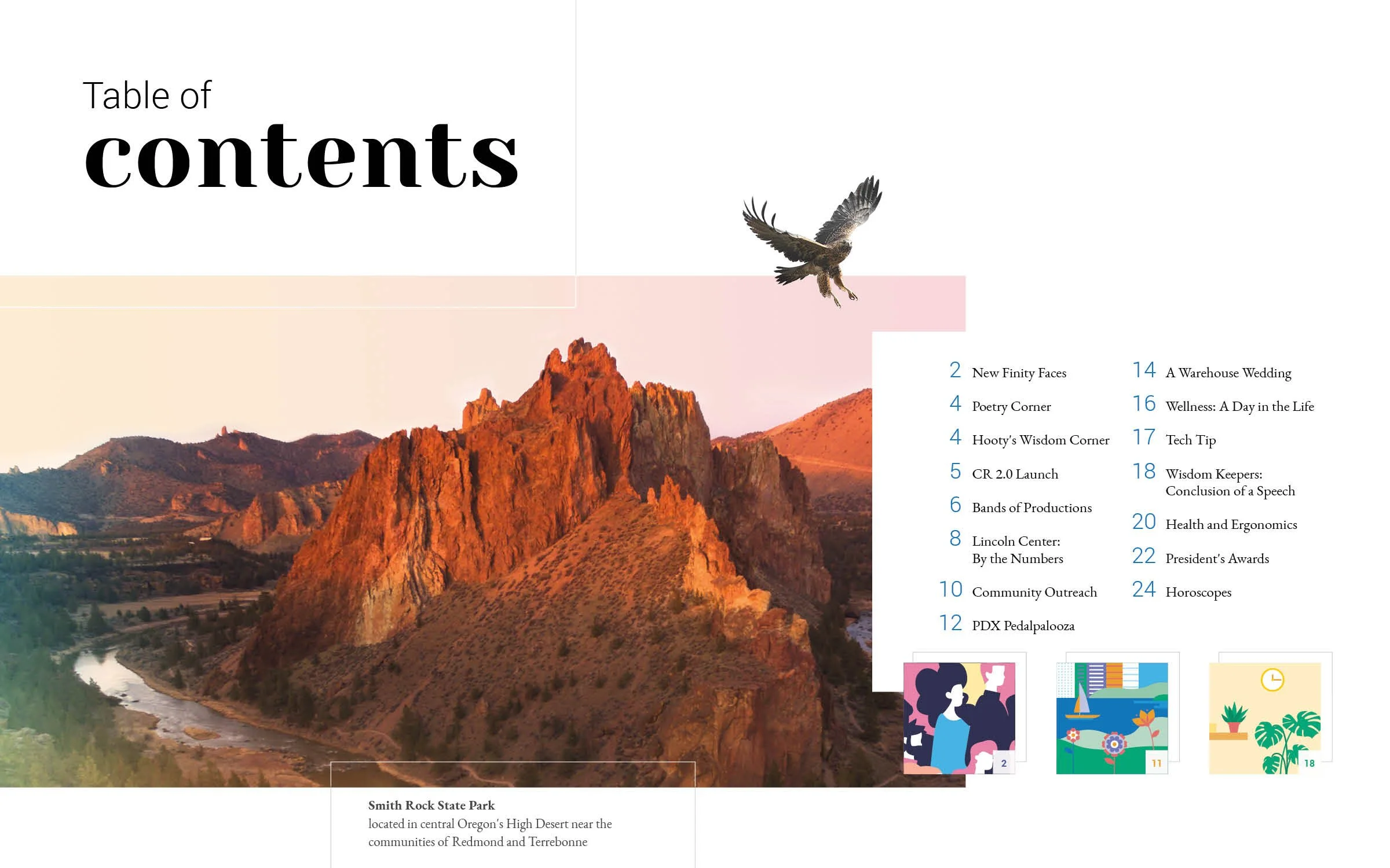
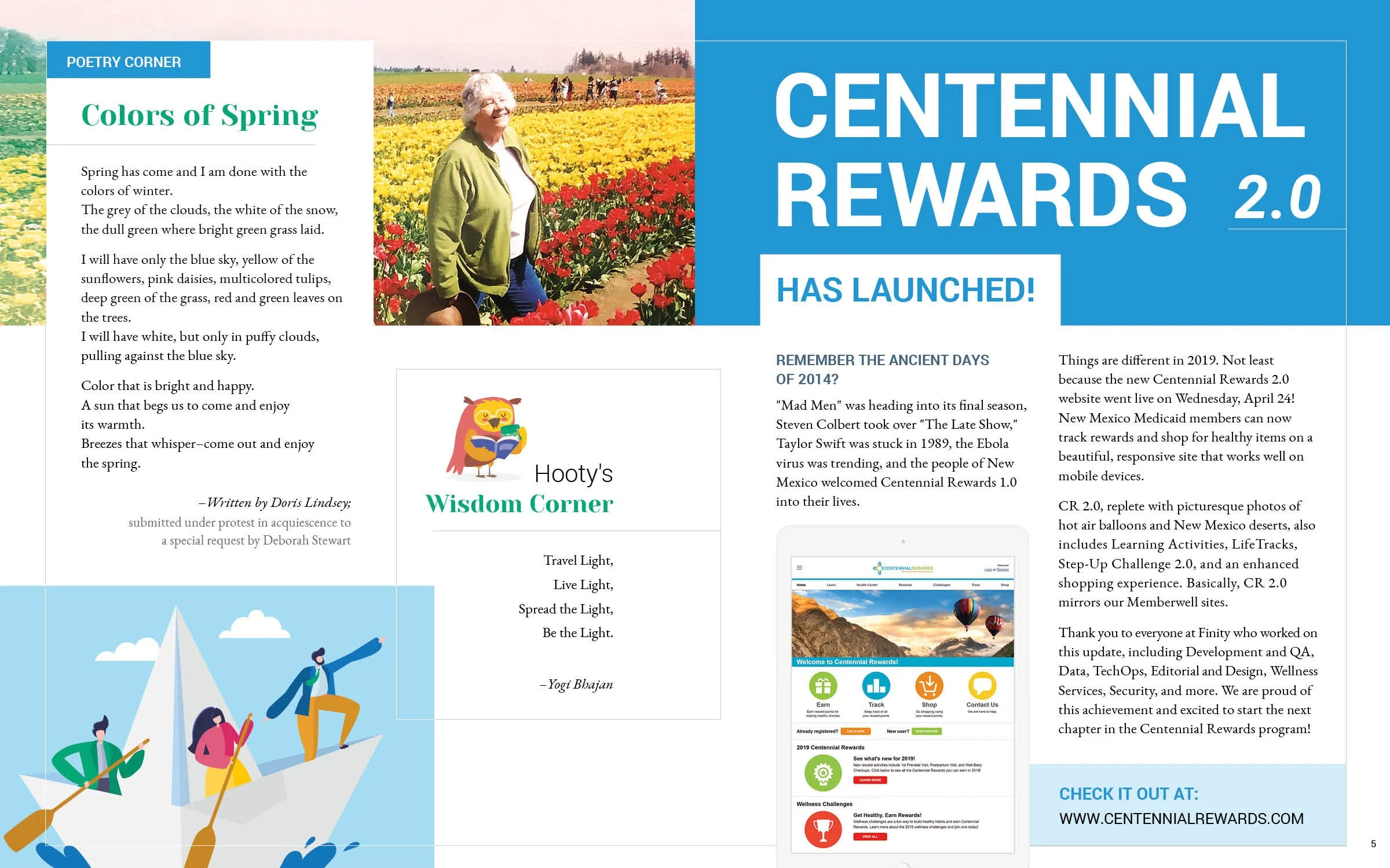
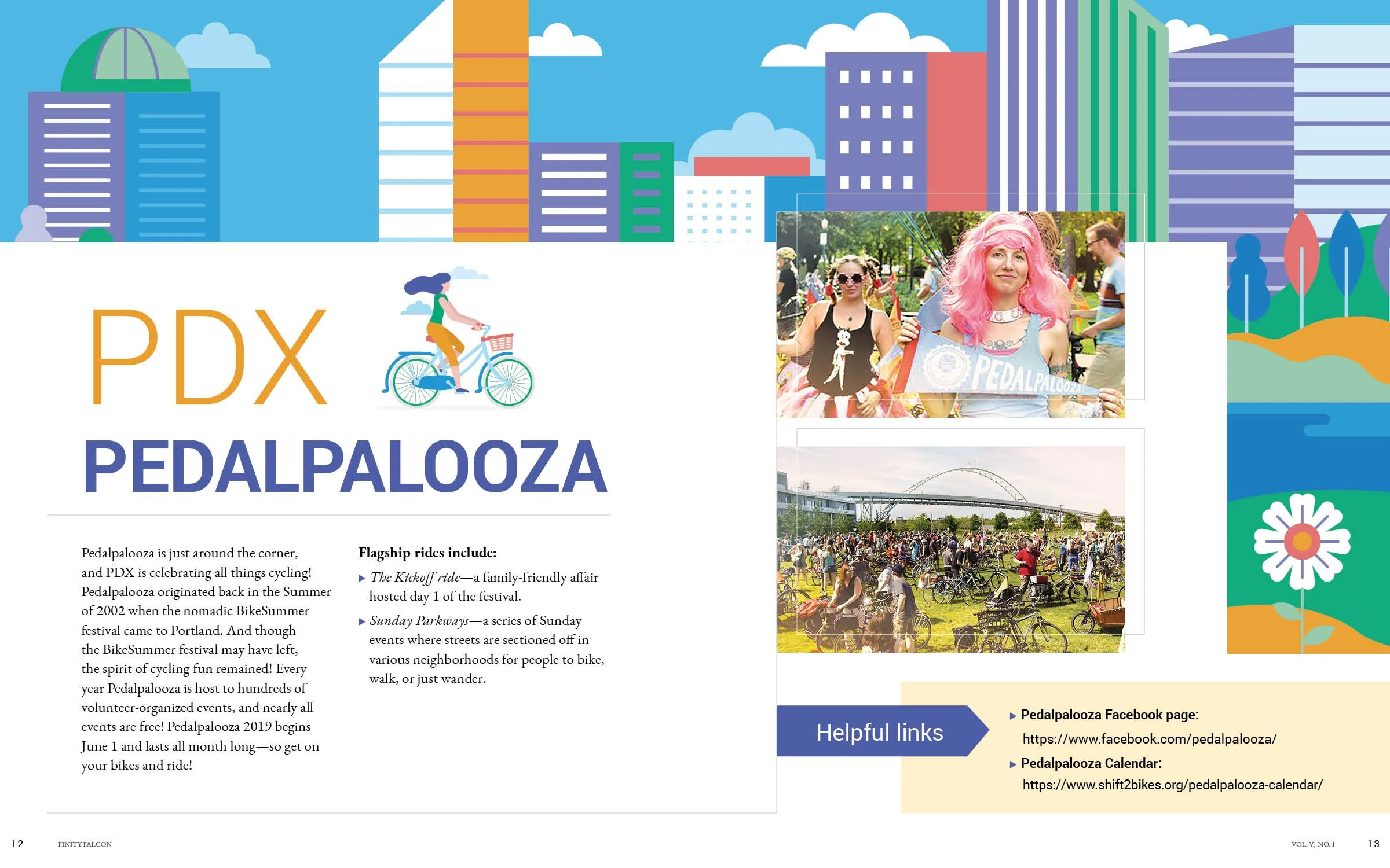
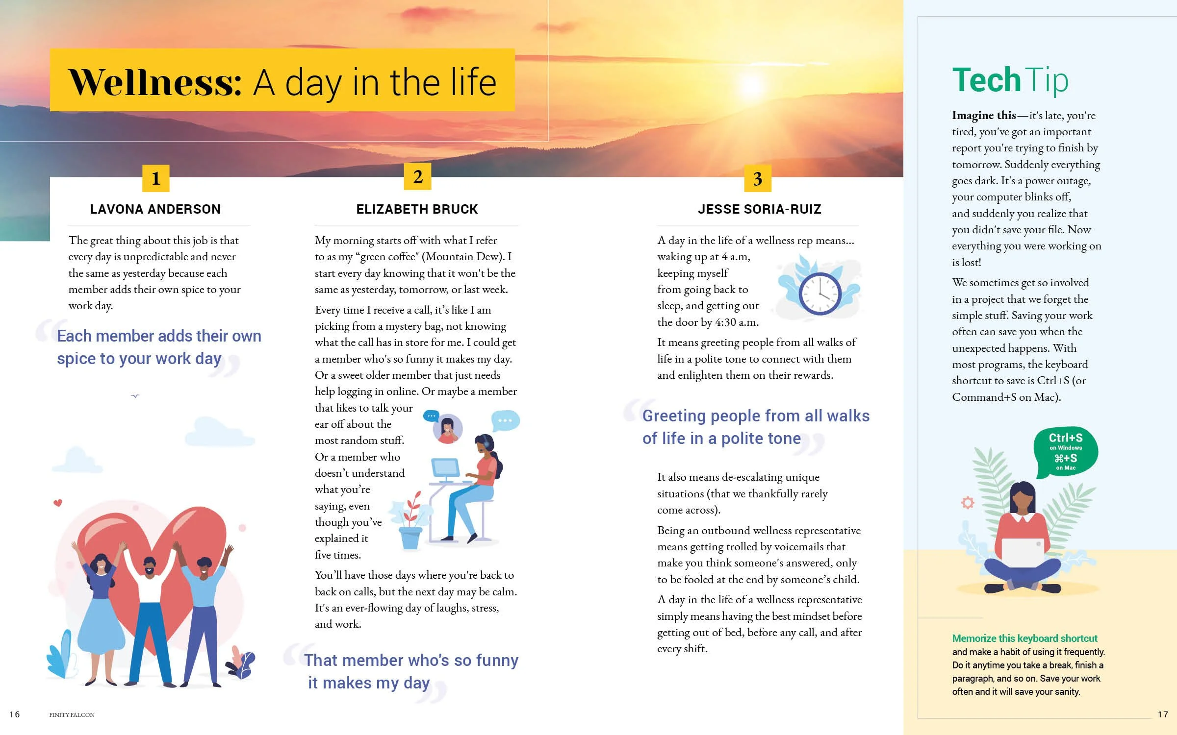
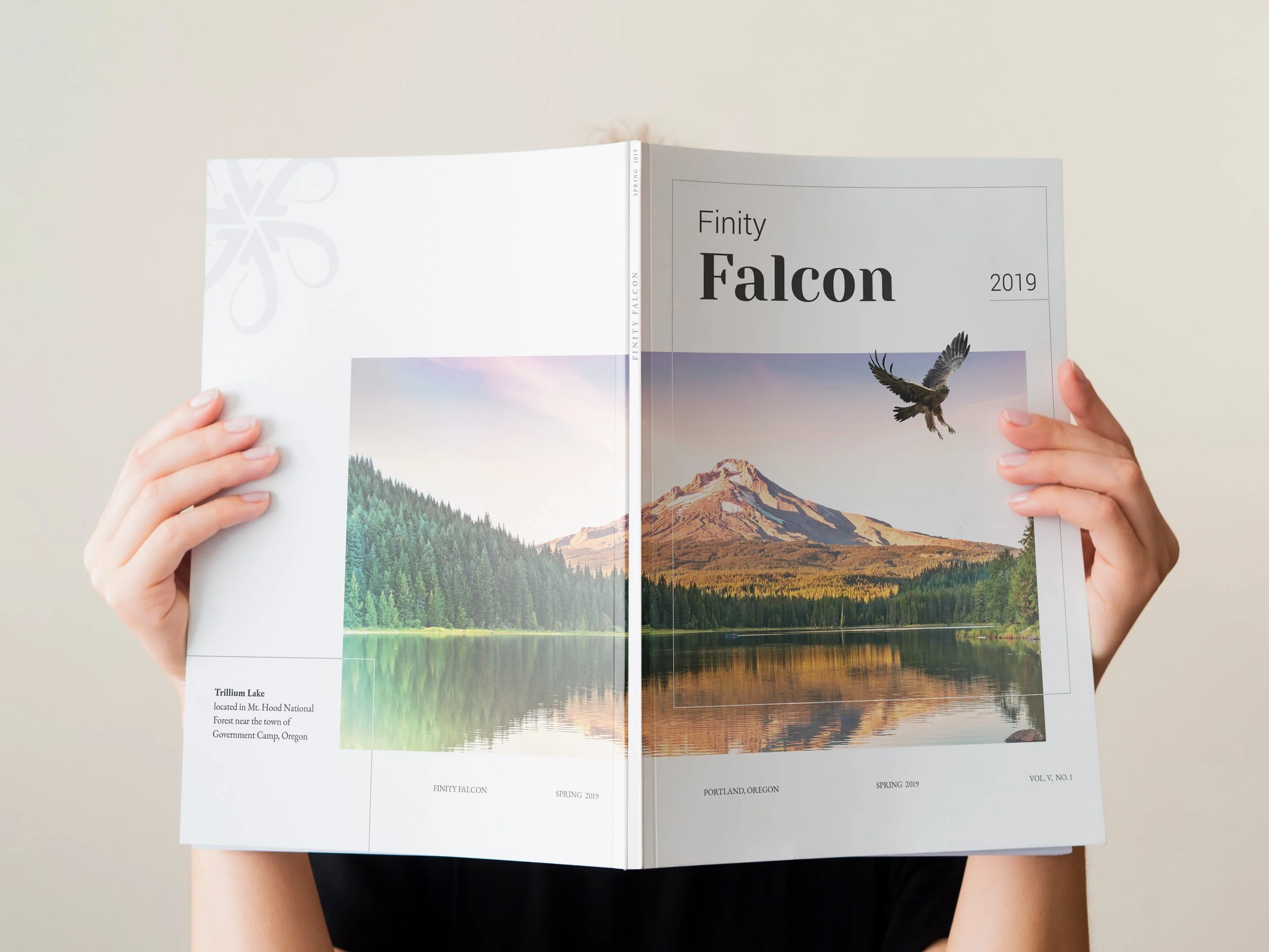
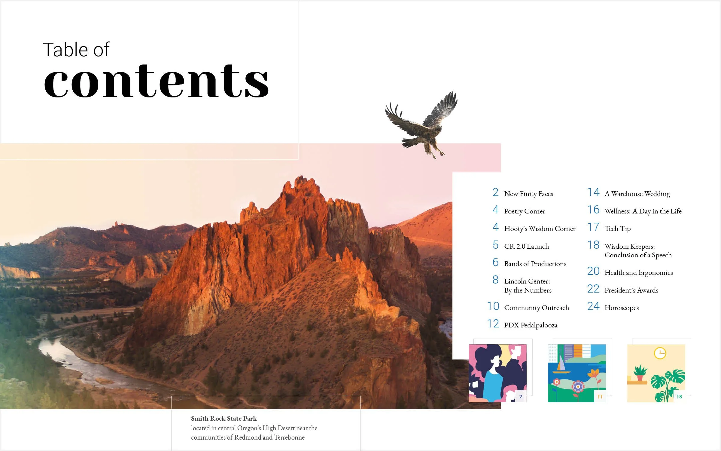
Incorporating Oregon landmarks was important to us as our company is based in Portland, OR and we wanted to highlight the natural beauty of our state. We made sure to mention the location of each landmark to inform the reader about it. Additionally, this allowed us to introduce the design elements that will be featured throughout the spread.


Design Decisions
Illustration & Photography
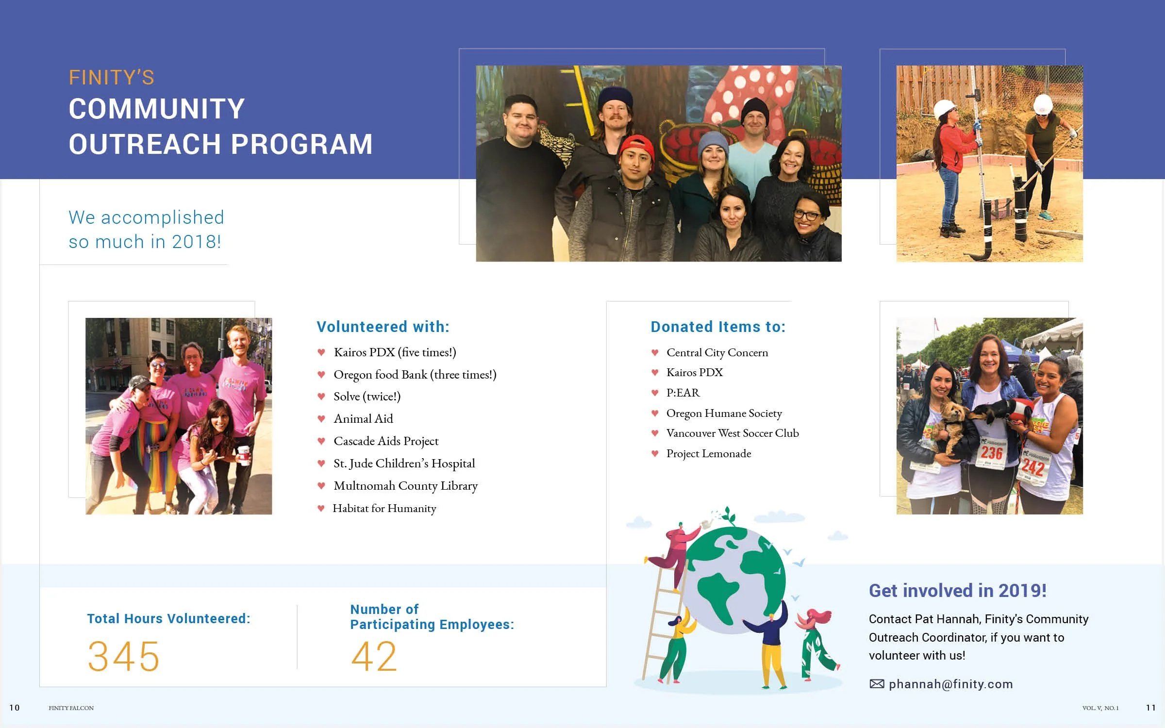
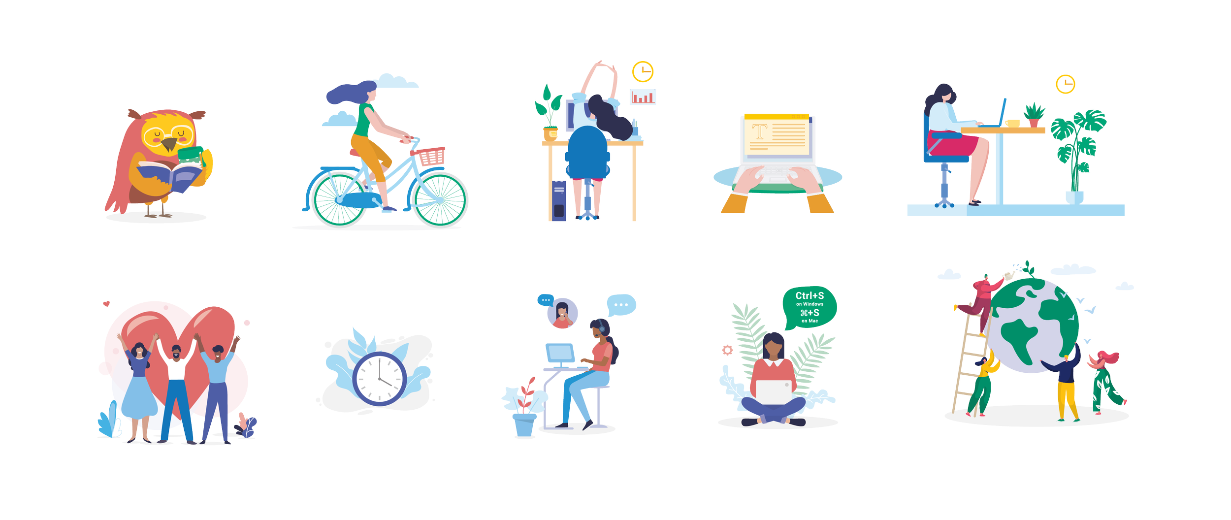
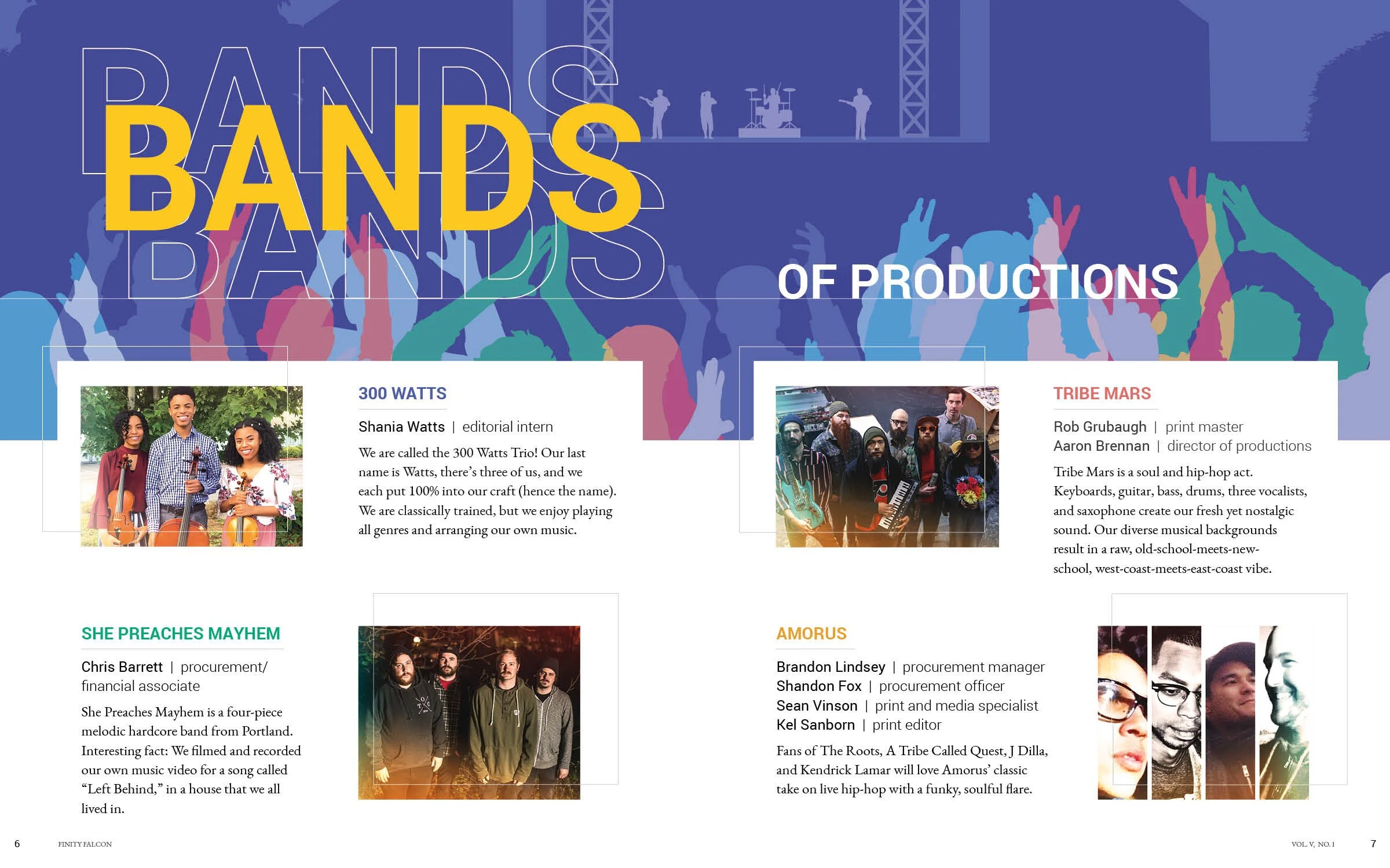
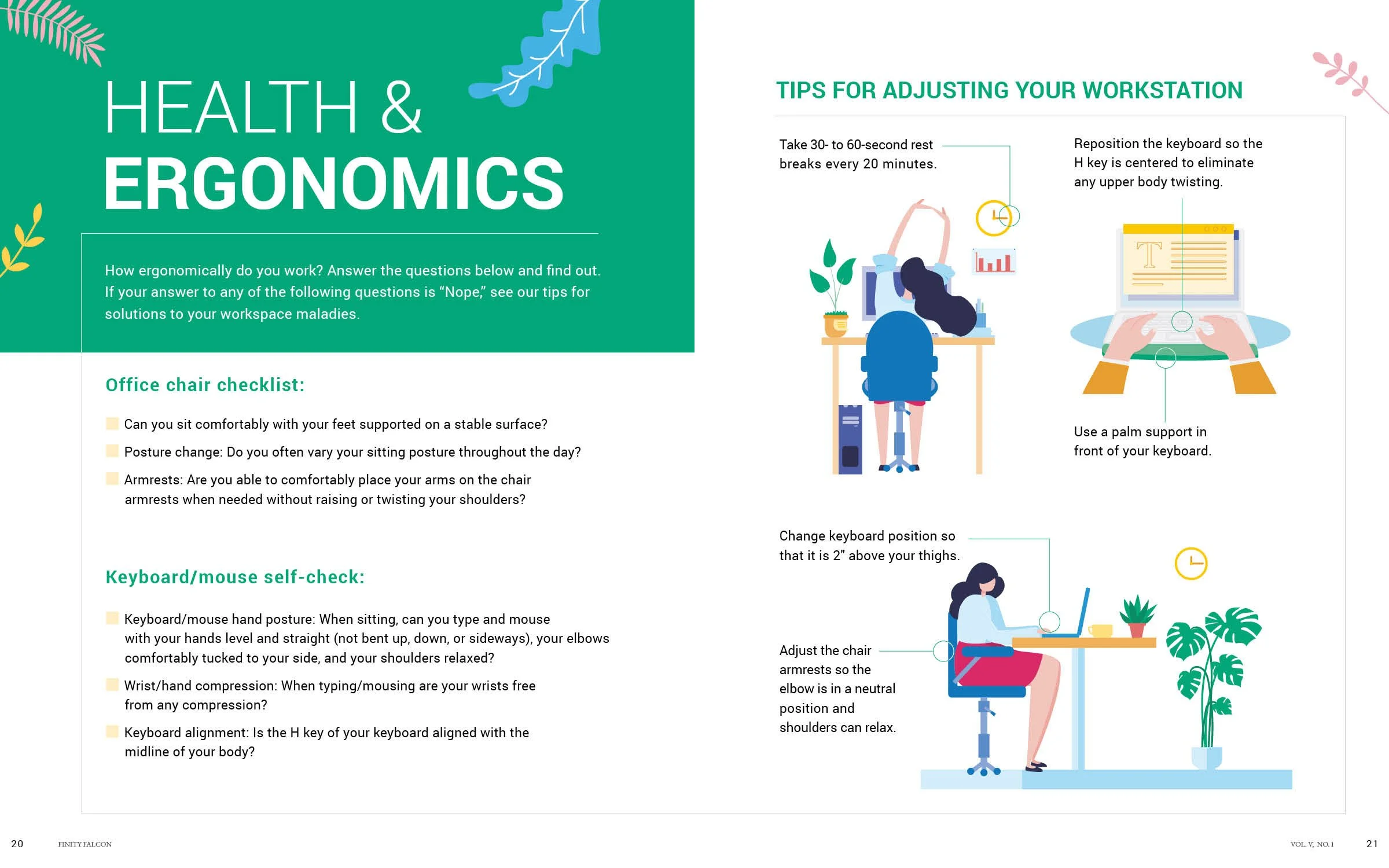
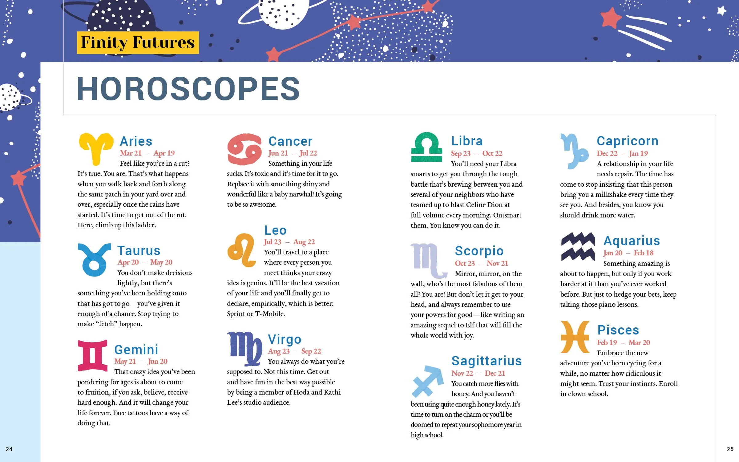
In combining illustration and photography, we opted for a simplified color scheme for the illustrations to ensure all elements were harmonious and intentional.
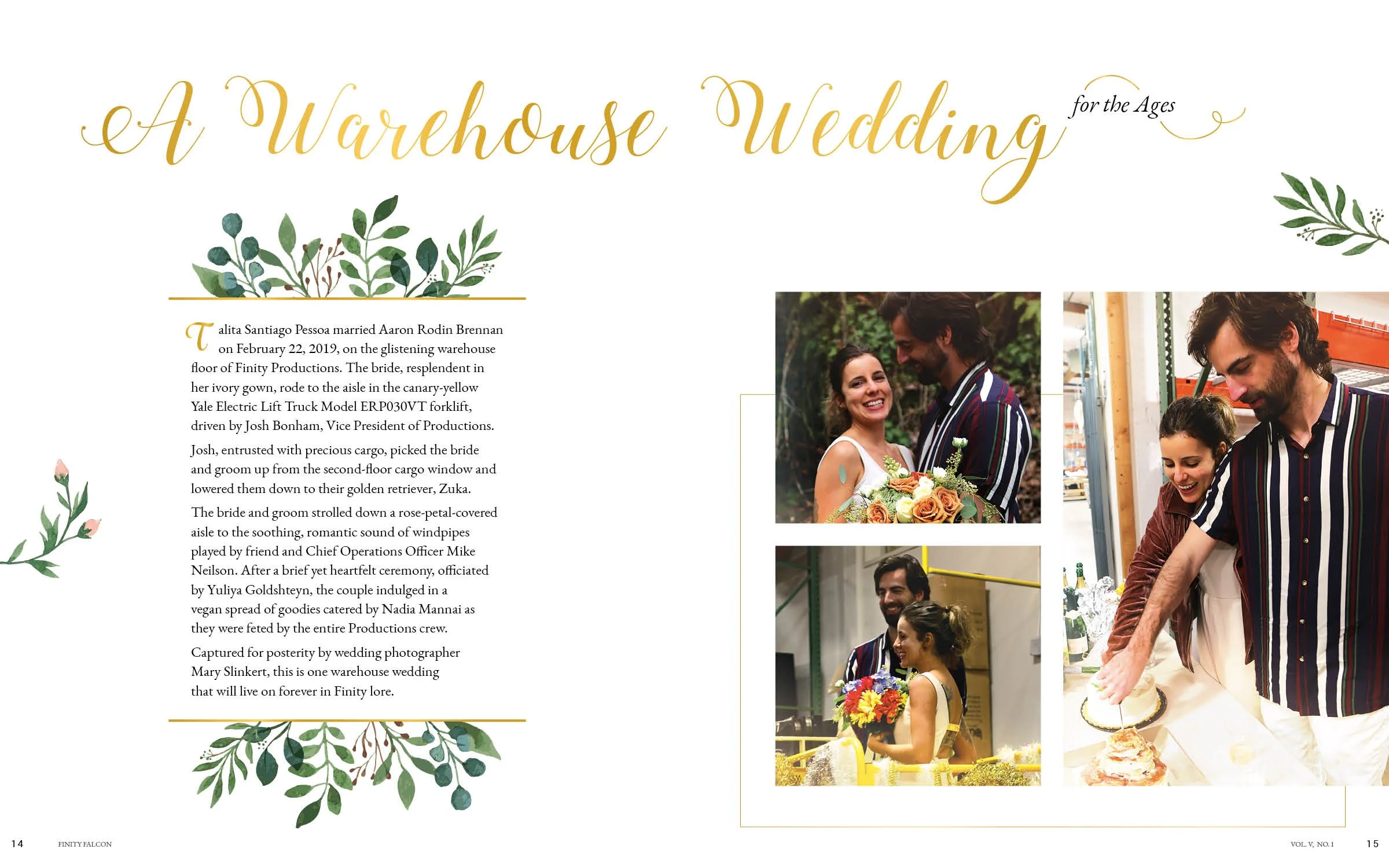
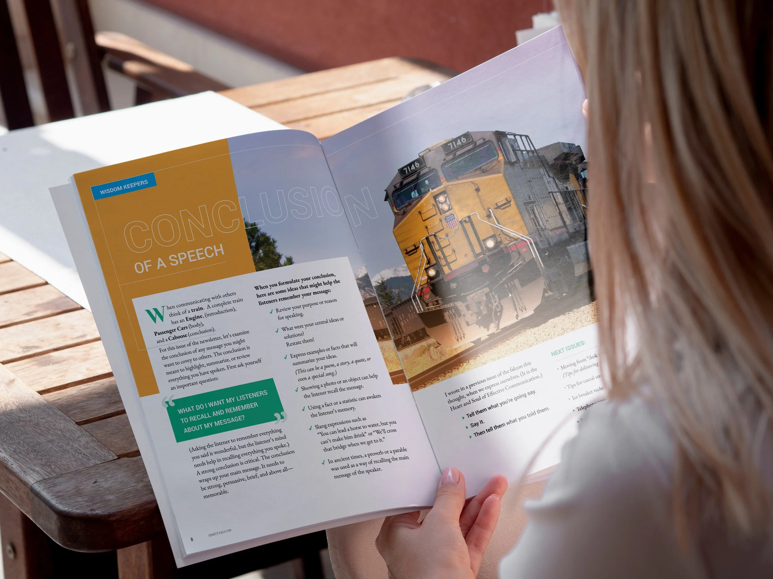
Thin line application
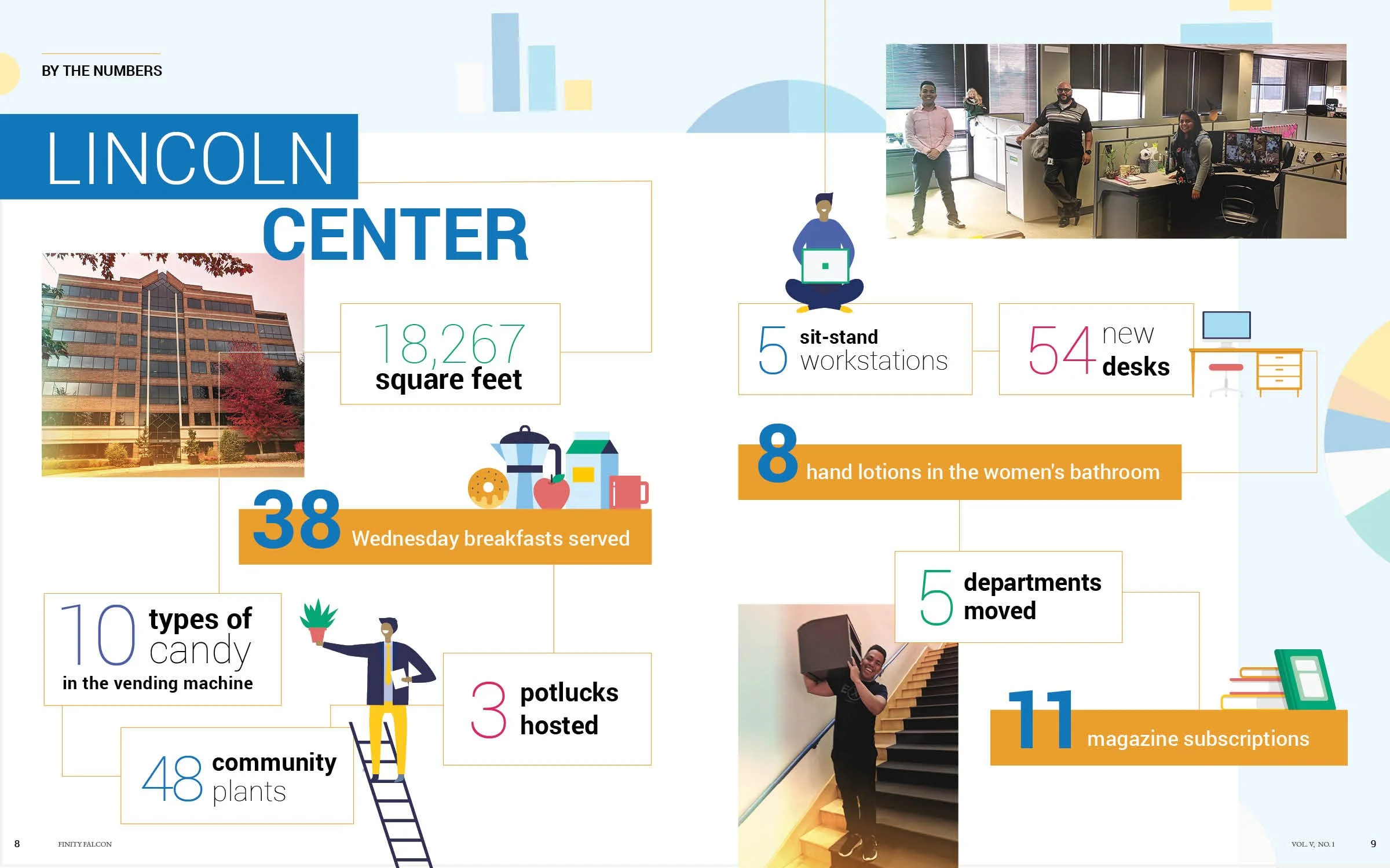
Consistency was established throughout the publication by incorporating a thin line in each spread which not only served as a decorative element but also as a way to draw the eye and highlight important information.
Illustration
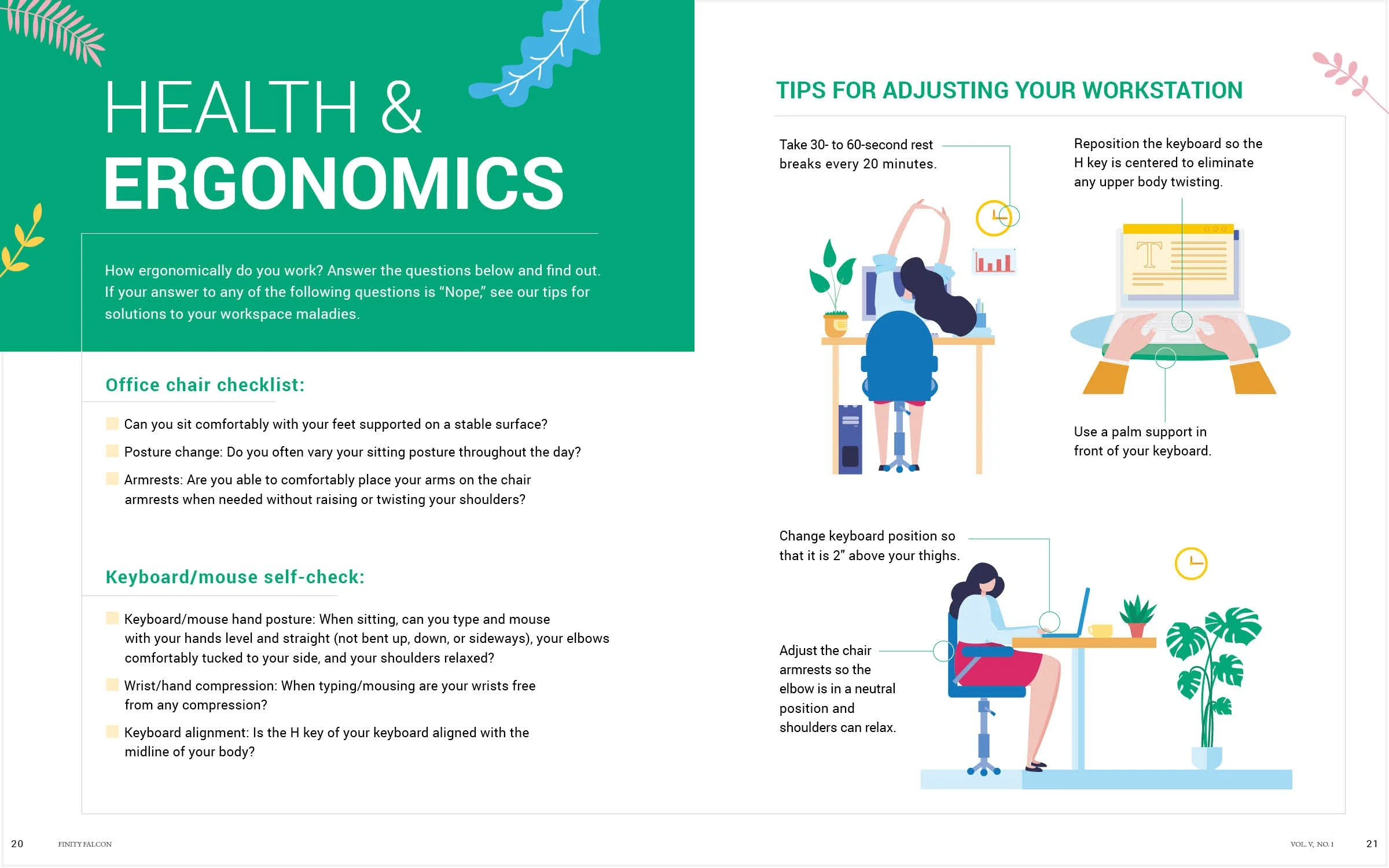
To align with the minimal and clean layout, we employed a flat character design and a simplified color palette. This approach resulted in humanized illustrations that added visual interest to the page without overwhelming the overall design.